Graphic Designs
Explore a collection of creative and colorful graphic projects.


Evolution of
"Once Upon a Dish"
"Design & Climate Week at Golden Gate Park"

"Poppy Soda Project"
"Typographical Poster"


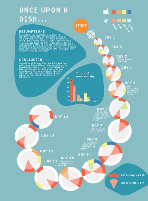
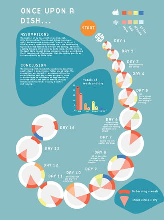
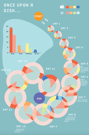
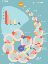
The designer created an infographic of recorded times when someone in her household had washed and dried the dishes. The earlier stages of this project had overlapping round plates. Each circular plate represents a day and is filled with a color according to when the person has washed and dried the dishes. The final poster has shrunk the spiraling plates’ perimeter to give space to the neighboring plates instead of overlapping the plates in her previous work.
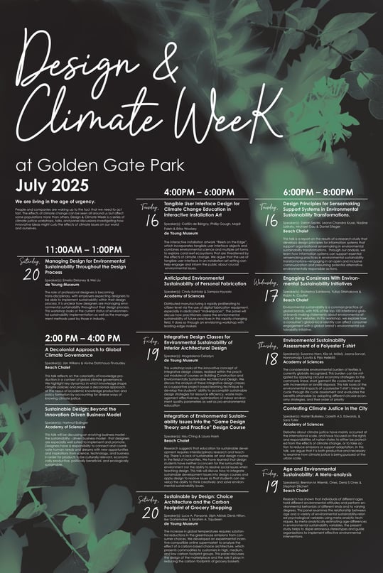
For this project, the designer created a poster that informs the reader of a series of events in Golden Gate Park. However, there are several constraints such as the poster can only have 2 Pantone colors and this poster must have all of the organized events. This designer decided to separate the events by time to make it easier for the reader to pick a time slot and find a date to attend. The poster came in many variations of fonts and organization from the start but it was narrowed down to a typeface that looks similar to cursive and handwritten look. The colors green and black resemble the leaves in Golden Gate Park
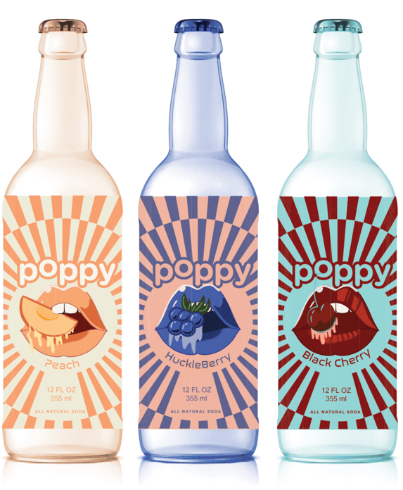
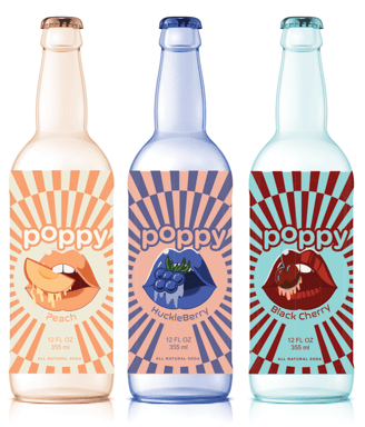
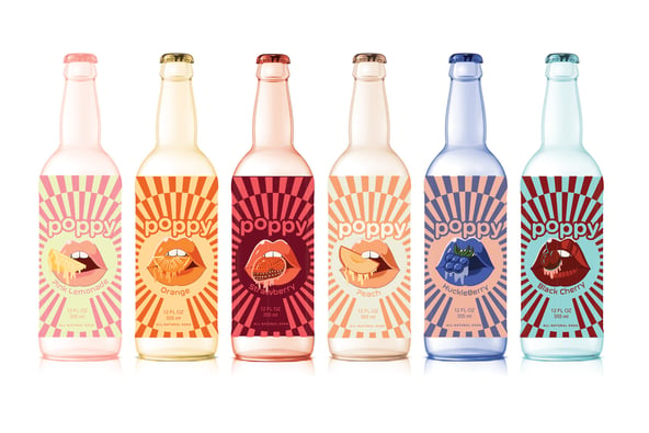
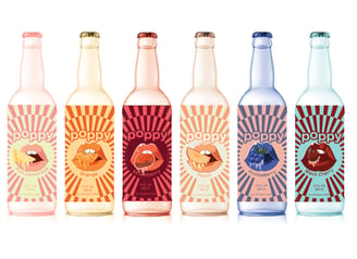
This project entails the designers recreating the face of soda bottles for a mock company called "Poppy Soda". With thorough planning and iterations, each poppy soda has a bottle that follows a system: lips, a slice of fruit, a checkered background, and vibrant colors associated with each flavor.
Created in the earliest stages of her design years, this poster tested her limits. This designer kept a few things from the original sketch such as the staircase formation of the word, "Courier" in its typeface. These vibrant colors and background tell the reader that this poster was a mock-up of the well-known game, Scrabble.