Evolution of
"Once Upon a Dish"
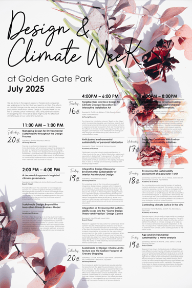
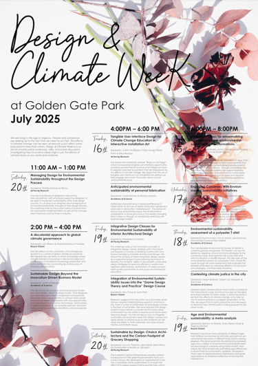
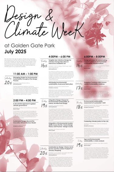
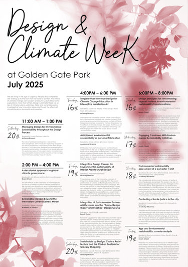
"Design & Climate Week at Golden Gate Park"
"Poppy Soda Project"
"Typographical Poster"
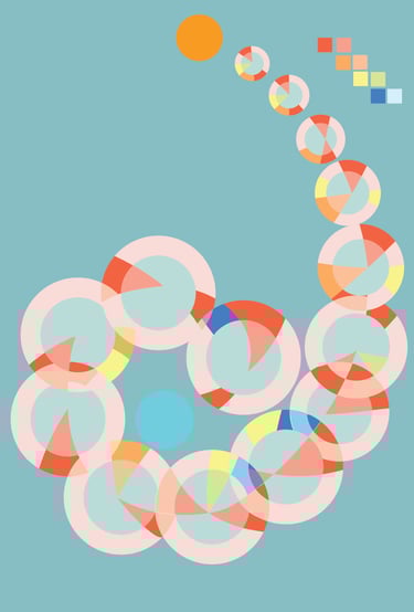
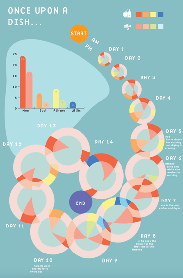
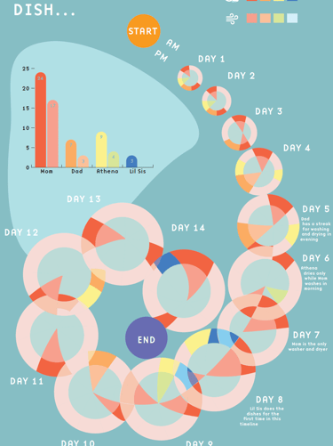
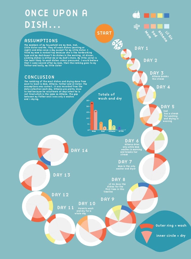
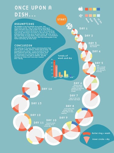
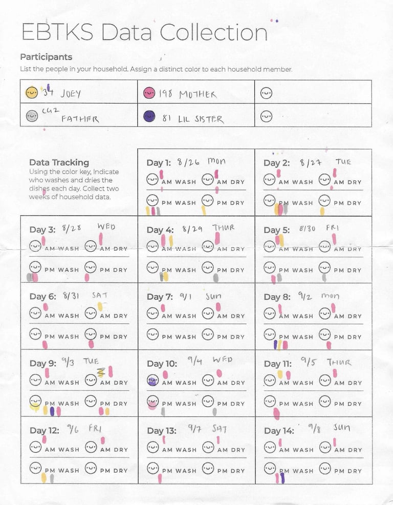
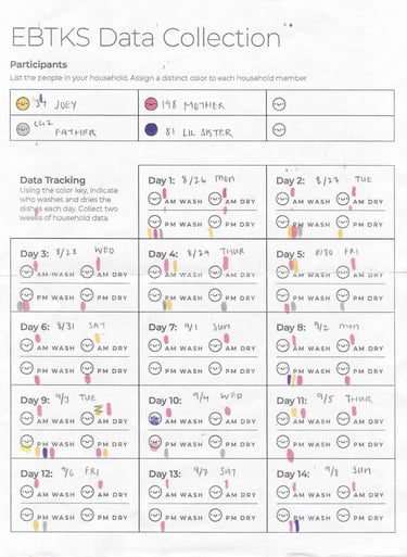
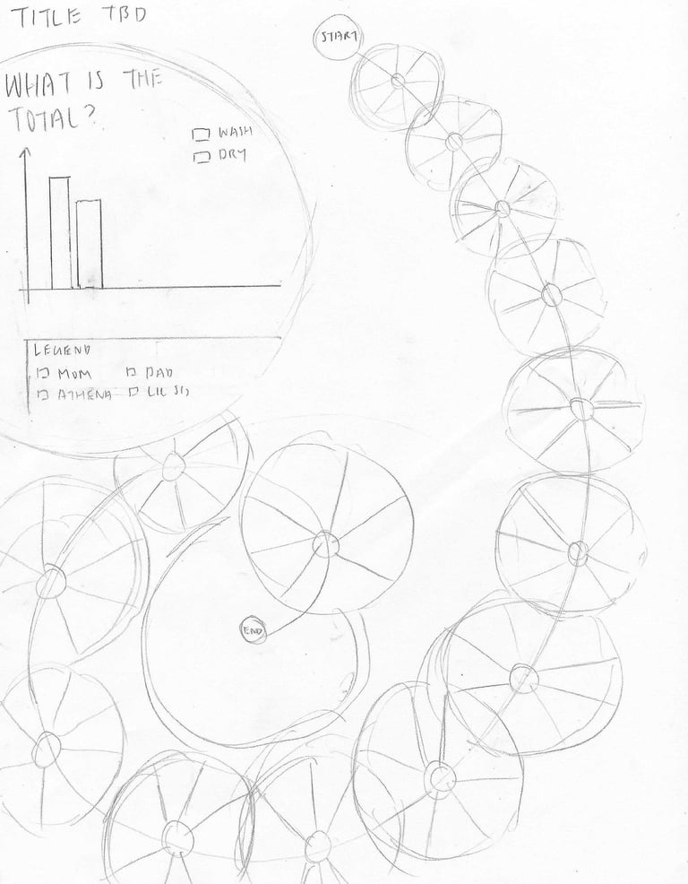
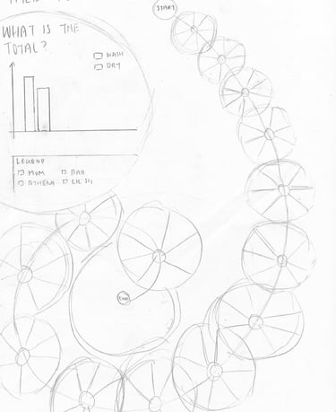
This is an infographic of recorded times when someone in my household had washed and dried the dishes. The earlier stages of this project had overlapping round plates. Each circular plate represents a day and is filled with a color according to when the person has washed and dried the dishes. The final poster has shrunk the spiraling plates’ perimeter to give space to the neighboring plates instead of overlapping the plates in her previous work.
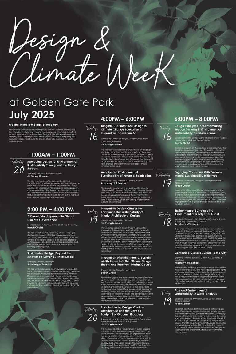
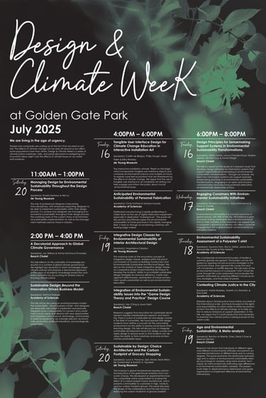
For this project, I created a poster that informs the reader of a series of events in Golden Gate Park. However, there are several constraints such as the poster can only have 2 Pantone colors and this poster must have all of the organized events. This designer decided to separate the events by time to make it easier for the reader to pick a time slot and find a date to attend. The poster came in many variations of fonts and organization from the start but it was narrowed down to a typeface that looks similar to cursive and handwritten look for friendliness. The colors green and black resemble the leaves in Golden Gate Park
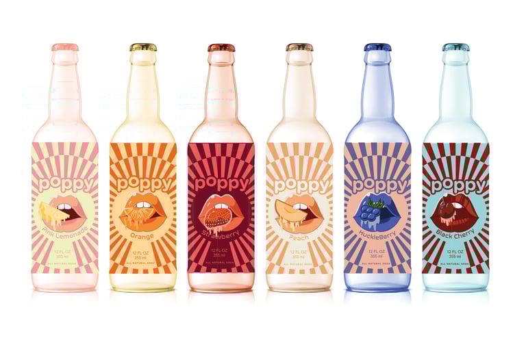
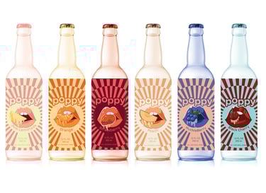
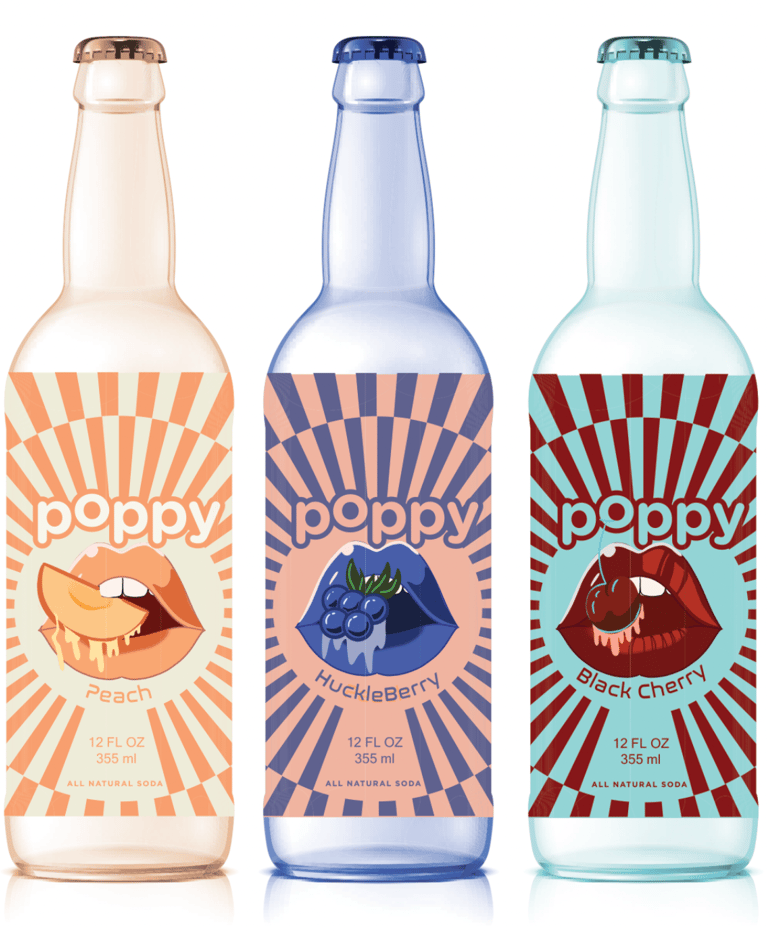
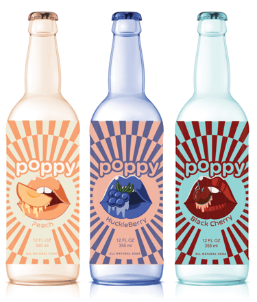
This project was an exercise to create a strong rebrand of a made up soda brand called "Poppy Soda". With thorough planning and iterations, each poppy soda has a bottle that follows a system: lips, a slice of fruit, a checkered background, and vibrant colors associated with each flavor.
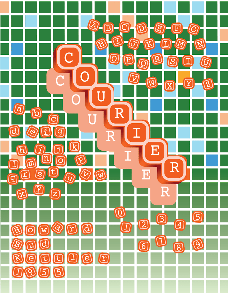
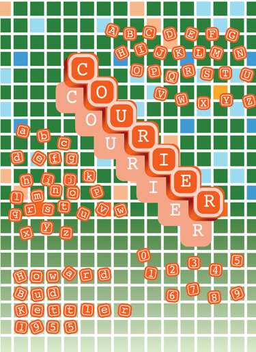
Created in the earliest stages of my design years, this poster tested my limits and knowledge. The project has a staircase formation of the word, "Courier" in its typeface. These vibrant colors and background tell the reader that this poster was a mock-up of the well-known game, Scrabble.
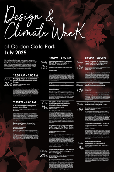

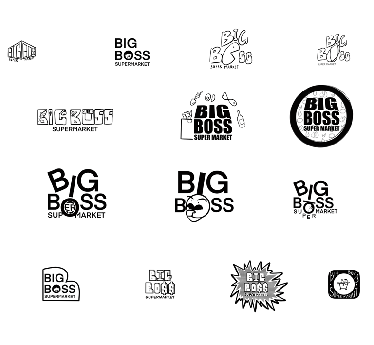
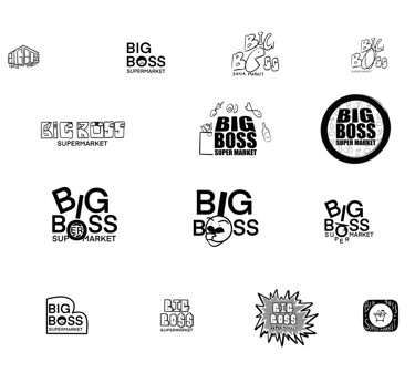
Rebrand "Big Boss"
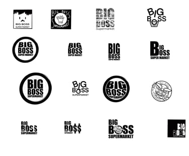
This project turns a local Chinese super market called "Big Boss Supermarket" into something refreshing. After running for a decade, they want to stand out and expand their customers. Below are the sketches of designs for the rebrand. This project is used for practicing purposes only and does not make any profit.
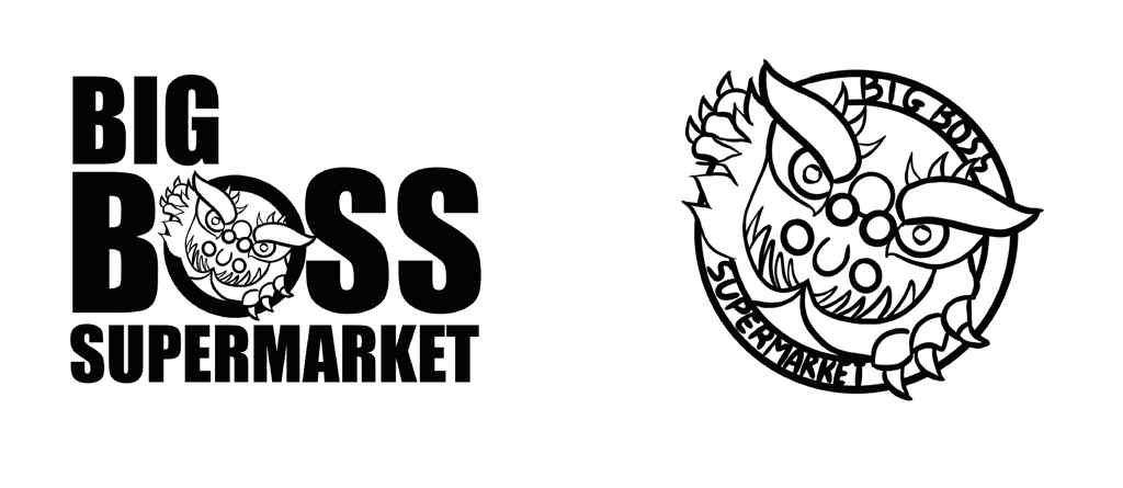
Above are the preliminaries. These are figures of lion dragons that symbolizes good fortune and abundance in Chinese culture which fits the store.
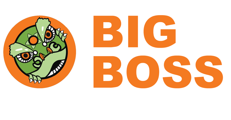
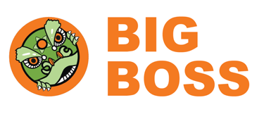
This is the final logo. The orange and lime green makes the logo brings a feel of freshness and brightness as well preserving the lucky colors, green and orange.

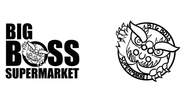
Preliminary
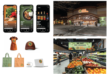
Collaterals
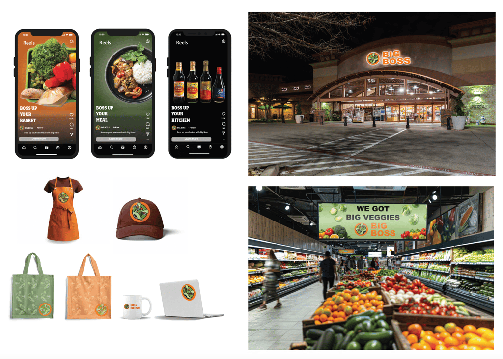
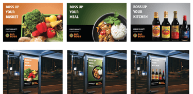
"Boss up" was a way to advertise the grocery store as "Big Boss" and conveys a strong message of reliability, boldness. The brand has its colors orange, and green with an occasional grey and black in its advertisement.
Sketch
Final Logo